Some of our NCT team took to the tracks as they went go-karting on an after-work social event. The venue presented the team with their best lap times, but as data-driven scientists and engineers, the team asked for the full results. Working on diverse projects, our engineers and scientists have to analyse lots of different kinds of data, so it is always an interesting exercise to see what insights they can draw. While the team were not able to get such detailed results as they might expect from the Grand Prix – sector times, trap speeds, etc, just the times for each of up to 23 laps for nine people constitute quite the hoard of data, of which this article merely scratches the surface.
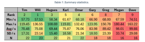
The first step when our scientists receive a small data set such as this is to put it in Excel or other spreadsheet software so it can be manipulated and viewed in its raw form. They can easily get out some simple summary statistics, such as the fastest lap time, and see that Will had the fastest lap, followed closely by Tim. One of our Engineering Consultants, Omar Shah, who analysed all of these statistics, said “I particularly like using the conditional formatting feature for quickly spotting some insights; for example, while Will is very fast, he also drove one of the slower laps – probably when I crashed into him! Hugues, meanwhile, has the fastest average time.”
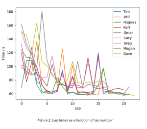
For visualisation and analysis, the team typically use Python, importing data from the spreadsheet using the pandas module. In the case of large, unwieldy data sets, they would skip Excel and go straight to Python. Omar used the boxplot function to visualise the results differently. Displayed in this manner, the subtle difference in lap time between Tim and Will is less evident, but other features are more evident: you can see for instance that Hugues has a very consistent lap time.

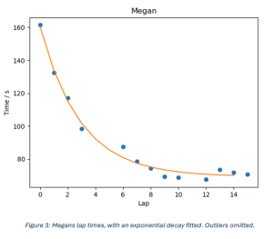
Another feature that is evident in the box plots is that all the results have a positive skew. This prompted Omar to plot lap times against lap number: a general downward trend is evident as the team got used to the track. To show this more clearly, he singled out Megan’s lap times, removing anomalies where a slow time was recorded due to an incident on the track. Omar used a function in the scipy library to fit an exponential decay function to the lap times. This gives some useful new metrics of performance: an extrapolated lap time once Megan had learnt the track, a rate of improvement, and how much she improved.
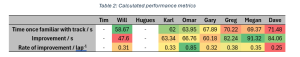
Extending this to the other racers gives some new ways of ranking: Will is the fastest, Megan improved the most, and, conveniently, Omar derived a metric by which he was the best: rate of improvement. Interestingly, Hugues and Tim do not submit themselves to this analysis; their lap times started really fast, so the lap-to-lap variation swamps the improvement.
If you need to unlock the full potential of your engineering data, get in touch with us at info@esrtechnology.com.